I write about network test, measurement and monitoring, but I rarely get a chance to actually do it myself. So when P3 Communications offered to do a deep-dive into my usage data if I took their recently launched U Get app for a spin, I used it as a chance to take an objective look at my own wireless user experience.
P3 Group launched U Get in late April of this year, and the point of the app is two-fold. Users get a free, device-based network measurement app that tracks the data speeds they are able to access on 3G, 4G and Wi-Fi; how often their calls get dropped; how much time they spend on 3G, 4G and Wi-Fi networks; signal strength; and whether those networks are readily available/reliable. In exchange, P3 gets to access the anonymized, aggregated usage data for insights on everything from the popularity of various apps to trends in call volume to the general breakdown of network types across users from different wireless carriers.
My device: Samsung Galaxy S6, a little more than two years old.
Networks: Verizon for cellular. For Wi-Fi, I’m primarily on my home network and occasionally on public Wi-Fi hot spots.
The app itself is pretty much download-it-and-forget-it and seems very lightweight overall. It doesn’t pop up any notifications, it just sits in the background on your phone and tracks what apps you’re using.

Data usage was negligible — of the top 20 apps using data on my phone in the last two months, U Get came in between 17 and 19 each month and registered less than 0.01 GB.
One of my big concern with a usage-tracking app was wondering how much it was going to impact my battery life. P3 first sent me a demo phone unit and I burned through the battery like crazy because I didn’t have its settings optimized (long screen idle time, and I kept the Wi-Fi off to get a better sense of my cellular-only usage). Once I downloaded U Get onto my own phone, the difference between having U Get on my device and not having it was imperceptible in terms of battery life impacts.
Personal data, of course, is also top of mind when you’re considering whether to allow a company access to your usage data. I’m familiar with the type of data reports that P3 generates, as I’ve written about things like their assessment of T-Mobile throttling Binge On speeds and other usage trends, including their initial assessment of Pokemon Go‘s impact on data usage and battery life. Of course, you take any company at their word about what they’re actually doing with your data, but it was reassuring that P3 was a stickler about making me jump through several permissions hoops before they would discuss my own personal usage information with me — even with the demo unit that they sent me.
Overall, my wireless experience is pretty good, and the U Get data reflected that. It also reminded me

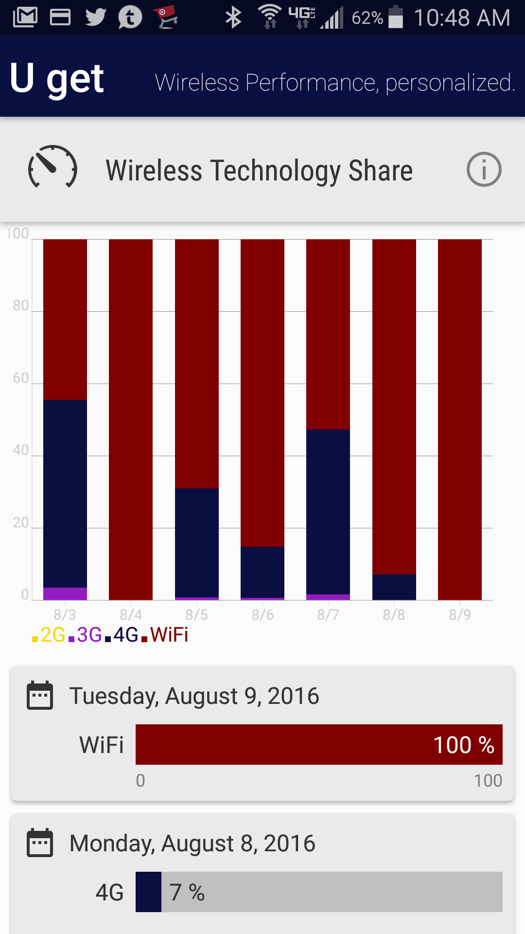
just how much time I spend on Wi-Fi versus cellular networks. In a conversation with P3 Communications CEO Dirk Bernhardt to go over the comparison of my results versus the average usage across the four national U.S. carriers, he pointed out that the cellular operators often have very little insight into what their users are experiencing when they’re on Wi-Fi — which is a big chunk of their overall experience. P3’s data shows that Verizon’s users are on Wi-Fi 54% of the time; AT&T and Sprint customers are on Wi-Fi almost 47% of the time, and T-Mobile US has the lowest Wi-Fi share at 34.2%. Comparatively, I spend about 90% of my time on a Wi-Fi network.
In terms of my overall usage data, the biggest thing that jumped out to me in going over the data is that I’m not a typical user. For one thing, I don’t watch YouTube on my phone (I tend to watch videos via social media and on my desktop) — for the four carriers, YouTube accounts for a large percentage of generated data traffic, with Facebook (my #1 app) coming in second. I pay close attention to limiting my app sessions when I’m on a cellular network versus Wi-Fi and that was reflected in app session length on the two network types.
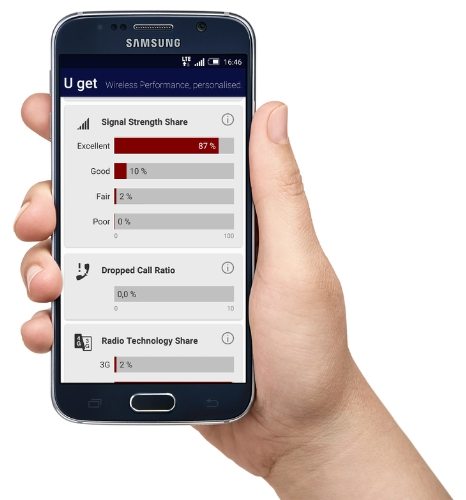
Signal strength was an interesting metric as well. For all that I’m used to thinking of signal bars as corresponding to my user experience (even though I know it’s more complicated than that in terms of radio environment and user experience), the vast majority of my usage only fell into “fair” signal strength even though I consider my user experience pretty darn good.
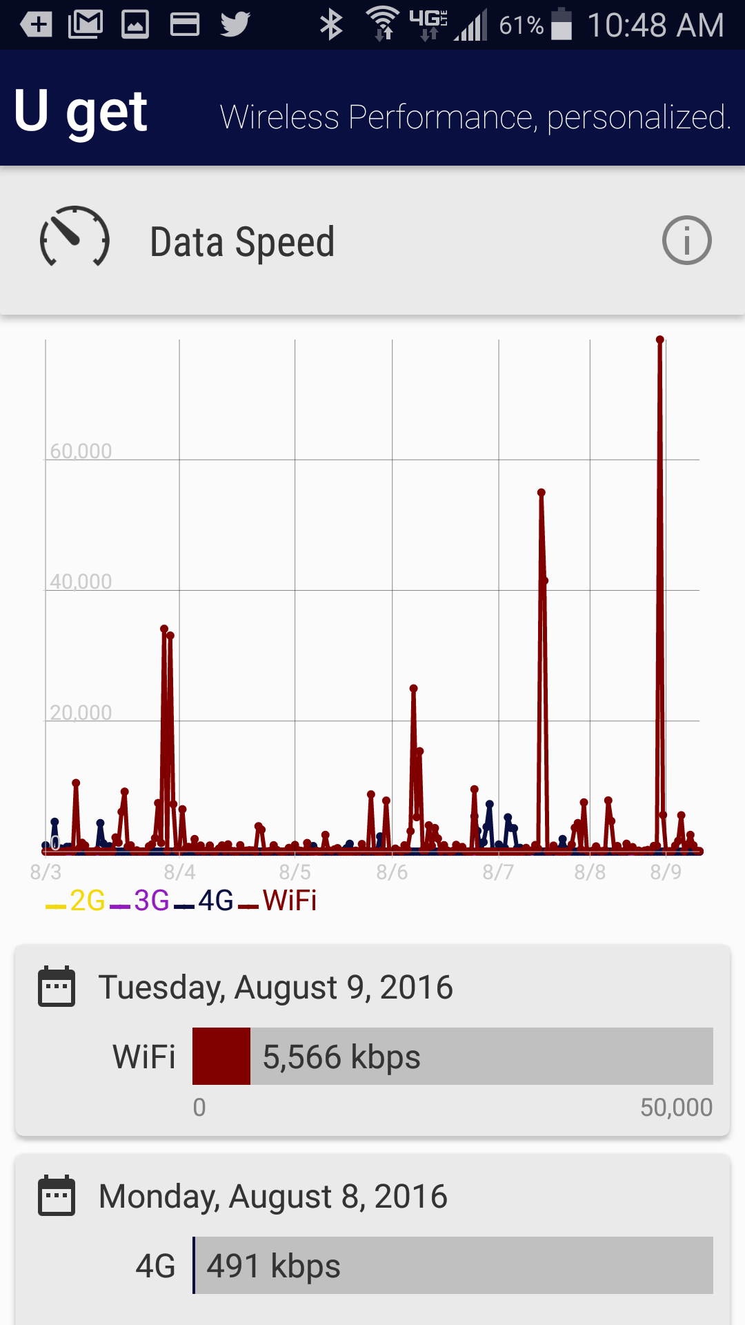
As far as the app itself, the basic metrics that it chooses to display are useful ones and definitely gave me more precise insight into speeds and how I’m spending my network time. Tapping on any of the front-page graphs takes you into more detailed breakdowns of each day’s stats, which would be really useful if I was having significant network issues or trying to figure out if I was having a problem with my Wi-Fi or cellular network versus an app, or if I should switch carriers.
For me personally, though, U Get gave me exactly what I was looking for: some data to back up my own subjective impression of my user experience. Now I just need to decide if that 90% Wi-Fi usage means I should upgrade my home network to 802.11ac.
Follow me on Twitter! @khillrcr

P3's U Get app: Tracking my wireless experience
ABOUT AUTHOR
